

|
|

|
Промышленный лизинг
Методички
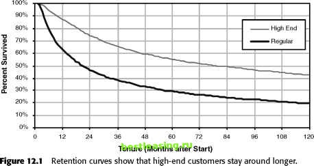 Another way to compare the different groups is by asking how long it takes for half the customers to leave-the customer half-life (although the statistical term is the median customer lifetime). The median is a useful measure because the few customers who have very long or very short lifetimes do not affect it. In general, medians are not sensitive to a few outliers. Figure 12.2 illustrates how to find the customer half-life using a retention curve. This is the point where exactly 50 percent of the customers remain, which is where the 50 percent horizontal grid line intersects the retention curve. The customer half-life for the two groups shows a much starker difference than the 10-year survival-the premium customers have a median lifetime of close to 7 years, whereas the regular customers have a median a bit under over 2 years. Finding the Average Tenure from a Retention Curve The customer half-life is useful for comparisons and easy to calculate, so it is a valuable tool. It does not, however, answer an important question: How much, on average, were customers worth during this period of time? Answering this question requires having an average customer worth per time and an average retention for all the customers. The median cannot provide this information because the median only describes what happens to the one customer in the middle; the customer at exactly the 50 percent rank. A question about average customer worth requires an estimate of the average remaining lifetime for all customers. There is an easy way to find the average remaining lifetime: average customer lifetime during the period is the area under the retention curve. There is a clever way of visualizing this calculation, which Figure 12.3 walks through. 100% 90% 80% 70% 60% 50% 40% 30% 20% 10% 0%
36 48 60 72 Tenure (Months after Start) Figure 12.2 The median customer lifetime is where the retention curve crosses the 50 percent point. First, imagine that the customers all lie down with their feet lined up on the left. Their heads represent their tenure, so there are customers of all different heights (or widths, because they are horizontal) for customers of all different tenures. For the sake of visualization, the longer tenured customers lie at the bottom holding up the shorter tenured ones. The line that connects their noses counts the number of customers who are retained for a particular period of time (remember the assumption that all customers started at about the same point in time). The area under this curve is the sum of all the customers tenures, since every customer lying horizontally is being counted. Dividing the vertical axis by the total count produces a retention curve. Instead of count, there is a percentage. The area under the curve is the total tenure divided by the count of customers-voila, the average customer tenure during the period of time covered by the chart. TIP The area under the customer retention curve is the average customer lifetime for the period of time in the curve. For instance, for a retention curve that has 2 years of data, the area under the curve represents the two-year average tenure. This simple observation explains how to obtain an estimate of the average customer lifetime. There is one caveat when some customers are still active. The average is really an average for the period of time under the retention curve. Consider the earlier retention curve in this chapter. These retention curves were for 10 years, so the area under the curves is an estimate of the average customer lifetime during the first 10 years of their relationship. For customers who are still active at 10 years, there is no way of knowing whether they will all leave at 10 years plus one day; or if they will all stick around for another century. For this reason, it is not possible to determine the real average until all customers have left. A group of customers with different tenures are stacked on top of each =1 other. Each bar represents one ,. д customer. time At each point in time, the edges count the number of customers active at that time. Notice that the sum of all the areas is the sum of all the customer tenures. Making the vertical axis a proportion instead of a count produces a curve n ofers that looks the same. This is a I § t у retention curve. P The area under the retention curve is the average customer tenure. Figure 12.3 Average customer tenure is calculated from the area under the retention curve. This value, called truncated mean lifetime by statisticians, is very useful. As shown in Figure 12.4, the better customers have an average 10-year lifetime of 6.1 years; the other group has an average of 3.7 years. If, on average, a customer is worth, say, $100 per year, then the premium customers are worth $610 - $370 = $240 more than the regular customers during the 10 years after they start, or about $24 per year. This $24 might represent the return on a retention program designed specifically for the premium customers, or it might give an upper limit of how much to budget for such retention programs. Looking at Retention as Decay Although we dont generally advocate comparing customers to radioactive materials, the comparison is useful for understanding retention. Think of customers as a lump of uranium that is slowly, radioactively decaying into lead. Our good customers are the uranium; the ones who have left are the lead. Over time, the amount of uranium left in the lump looks something like our retention curves, with the perhaps subtle difference that the timeframe for uranium is measured in billions of years, as opposed to smaller time scales. 1 2 3 4 5 6 7 8 9 10 11 12 13 14 15 16 17 18 19 20 21 22 23 24 25 26 27 28 29 30 31 32 33 34 35 36 37 38 39 40 41 42 43 44 45 46 47 48 49 50 51 52 53 54 55 56 57 58 59 60 61 62 63 64 65 66 67 68 69 70 71 72 73 74 75 76 77 78 79 80 81 82 83 84 85 86 87 88 89 90 91 92 93 94 95 96 97 98 99 100 101 102 103 104 105 106 107 108 109 110 111 112 113 114 115 116 117 118 119 120 121 122 123 124 125 126 127 128 129 130 131 132 133 134 135 136 [ 137 ] 138 139 140 141 142 143 144 145 146 147 148 149 150 151 152 153 154 155 156 157 158 159 160 161 162 163 164 165 166 167 168 169 170 171 172 173 174 175 176 177 178 179 180 181 182 183 184 185 186 187 188 189 190 191 192 193 194 195 196 197 198 199 200 201 202 203 204 205 206 207 208 209 210 211 212 213 214 215 216 217 218 219 220 221 222 |
||||||||||||||||||||||||||||||||||||||||||||||||||||||||||||||||||||||||||||||||||||||||||||||||||||||||||||||||||||||||