

|
|

|
Промышленный лизинг
Методички
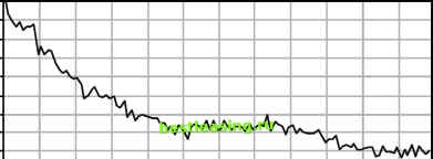 Actually, it is more than odd, it violates the very idea notion of retention. For instance, it opens the possibility that the curve will cross the 50 percent threshold more than once, leading to the odd, and inaccurate, conclusion that there is more than one median lifetime, or that the average retention for customers during the first 10 weeks after they start might be more than the average for the first 9 weeks. What is happening? Are customers being reincarnated? These problems are an artifact of the way the curve was created. Customers acquired in any given time period may be better or worse than the customers acquired in other time periods. For instance, perhaps 9 weeks ago there was a special pricing offer that brought in bad customers. Customers who started 10 weeks ago were the usual mix of good and bad, but those who started 9 weeks ago were particularly bad. So, there are fewer of the bad customers after 9 weeks than of the better customers after 10 weeks. The quality of customers might also vary due merely to random variation. After all, in the previous figure, there are over 100 time periods being considered-so, all things being equal, some time periods would be expected to exhibit differences. A compounding reason is that marketing efforts change over time, attracting different qualities of customers. For instance, customers arriving by different channels often have different retention characteristics, and the mix of customers from different channels is likely to change over time. Survival Hazards give the probability that a customer might stop at a particular point in time. Survival, on the other hand, gives the probability of a customer surviving up to that time. Survival values are calculated directly from the hazards. 100% 90% 80% 70% с 60% с 50% Ф 40% 30% 20% 10% 0% 0 1020304050607080901 00110 Tenure (Weeks) Figure 12.9 A retention curve might be quite jagged. At any point in time, the chance that a customer survives to the next unit of time is simply 1 - hazard, which is called conditional survival at time t (it is conditional because it assumes that the customers survived up to time t). Calculating the full survival at a given time requires accumulating all the conditional survivals up to that point in time by multiplying them together. The survival value starts at 1 (or 100 percent) at time 0, since all customers included in analysis survive to the beginning of the analysis. Since the hazard is always between 0 and 1, the conditional survival is also between 0 and 1. Hence, survival itself is always getting smaller-because each successive value is being multiplied by a number less than 1. The survival curve itself starts at 1, gently goes down, sometimes flattening, perhaps, out but never rising up. Survival curves make more sense for customer retention purposes than the retention curves described earlier. Figure 12.10 shows a survival curve and its corresponding retention curve. It is clear that the survival curve is smoother, and that it slopes downward at all times. The retention curve bounces all over the place. The differences between the retention curve and the survival curve may, at first, seem nonintuitive. The retention curve is actually pasting together a whole bunch of different pictures of customers from the past, like a photo collage pieced together from a bunch of different photographs to get a panoramic image. In the collage, the picture in each photo is quite clear. However, the boundaries do not necessarily fit together smoothly. Different pictures in the collage look different, because of differences in lighting or perspective- differences that contribute to the aesthetic of the collage. 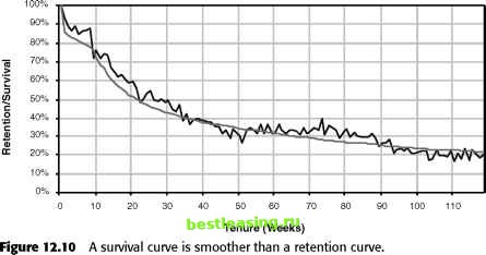 The same thing is happening with retention curves, where customers who start at different points in time have different perspectives. Any given point on the retention curve is close to the actual retention value; however, taken as a whole, it looks jagged. One way to remove the jaggedness is to focus on customers who start at about the same time, as suggested earlier in this chapter. However, this greatly reduces the amount of data contributing to the curve. Instead of using retention curves, use survival curves. That is, first calculate the hazards and then work back to calculate the survival curve. The survival curve, on the other hand, looks at as many customers as possible, not just the ones who started exactly n time periods ago. The survival at any given point in time t uses information from all customers. The hazard at time t uses information from all customers whose tenure is greater than or equal to that value (assuming all are in the population at risk). Survival, though, is calculated by combining all the information for hazards from smaller values of t. Because survival calculations use all the data, the values are more stable than retention calculations. Each point on a retention curve limits customers to having started at a particular point in time. Also, because a survival curve always slopes downward, calculations of customer half-life and average customer tenure are more accurate. By incorporating more information, survival provides a more accurate, smoother picture of customer retention. When analyzing customers, both hazards and survival provide valuable information about customers. Because survival is cumulative, it gives a good summary value for comparing different groups of customers: How does the 1-year survival compare among different groups? Survival is also used for calculating customer half-life and mean customer tenure, which in turn feed into other calculations, such as customer value. Because survival is cumulative, it is difficult to see patterns at a particular point in time. Hazards make the specific causes much more apparent. When discussing some real-world hazards, it was possible to identify events during the customer life cycle that were drivers of hazards. Survival curves do not highlight such events as clearly as hazards do. The question may also arise about comparing hazards for different groups of customers. It does not make sense to compare average hazards over a period of time. Mathematically, average hazard does not make sense. The right approach is to turn the hazards into survival and compare the values on the survival curves. The description of hazards and survival presented so far differs a bit from how the subject is treated in statistics. The sidebar A Note about Survival Analysis and Statistics explains the differences further. 1 2 3 4 5 6 7 8 9 10 11 12 13 14 15 16 17 18 19 20 21 22 23 24 25 26 27 28 29 30 31 32 33 34 35 36 37 38 39 40 41 42 43 44 45 46 47 48 49 50 51 52 53 54 55 56 57 58 59 60 61 62 63 64 65 66 67 68 69 70 71 72 73 74 75 76 77 78 79 80 81 82 83 84 85 86 87 88 89 90 91 92 93 94 95 96 97 98 99 100 101 102 103 104 105 106 107 108 109 110 111 112 113 114 115 116 117 118 119 120 121 122 123 124 125 126 127 128 129 130 131 132 133 134 135 136 137 138 139 140 141 142 [ 143 ] 144 145 146 147 148 149 150 151 152 153 154 155 156 157 158 159 160 161 162 163 164 165 166 167 168 169 170 171 172 173 174 175 176 177 178 179 180 181 182 183 184 185 186 187 188 189 190 191 192 193 194 195 196 197 198 199 200 201 202 203 204 205 206 207 208 209 210 211 212 213 214 215 216 217 218 219 220 221 222 |