

|
|

|
Промышленный лизинг
Методички
ROC CURVES (continued) Reflects a test with the error profile represented by the following table:
Choosing a cutoff for the model score such that there are very few false positives, leads to a high rate of false negatives and vice versa. A good model (or medical test) has some scores that are good at discriminating between outcomes, thereby reducing both kinds of error. When this is true, the ROC curve bulges towards the upper-left corner. The area under the ROC curve is a measure of the models ability to differentiate between two outcomes. This measure is called discrimination. A perfect test has discrimination of 1 and a useless test for two outcomes has discrimination 0.5 since that is the area under the diagonal line that represents no model. ROC curves tend to be less useful for marketing applications than in some other domains. One reason is that the false positive rates are so high and the false negative rates so low that even a large change in the cutoff score does not change the shape of the curve much. 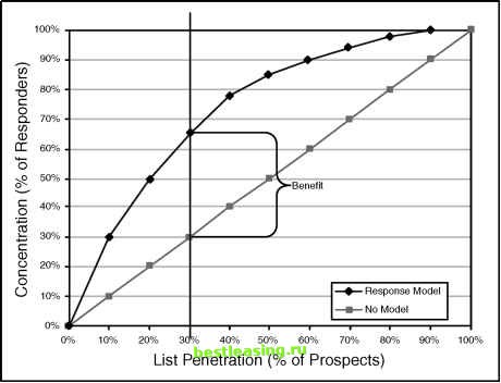 Figure 4.2 A cumulative gains or concentration chart shows the benefit of using a model. The upper, curved line plots the concentration, the percentage of all responders captured as more and more of the prospects are included in the campaign. The straight diagonal line is there for comparison. It represents what happens with no model so the concentration does not vary as a function of penetration. Mailing to 30 percent of the prospects chosen at random would find 30 percent of the responders. With the model, mailing to the top 30 percent of prospects finds 65 percent of the responders. The ratio of concentration to penetration is the lift. The difference between these two lines is the benefit. Lift was discussed in the previous chapter. Benefit is discussed in a sidebar. The model pictured here has lift of 2.17 at the third decile, meaning that using the model, SAC will get twice as many responders for its expenditure of $300,000 than it would have received by mailing to 30 percent of its one million prospects at random. Optimizing Campaign Profitability There is no doubt that doubling the response rate to a campaign is a desirable outcome, but how much is it actually worth? Is the campaign even profitable? Although lift is a useful way of comparing models, it does not answer these important questions. To address profitability, more information is needed. In particular, calculating profitability requires information on revenues as well as costs. Lets add a few more details to the SAC example. The Simplifying Assumptions Corporation sells a single product for a single price. The price of the product is $100. The total cost to SAC to manufacture, warehouse and distribute the product is $55 dollars. As already mentioned, it costs one dollar to reach a prospect. There is now enough information to calculate the value of a response. The gross value of each response is $100. The net value of each response takes into account the costs associated with the response ($55 for the cost of goods and $1 for the contact) to achieve net revenue of $44 per response. This information is summarized in Table 4.3. Table 4.3 Profit/Loss Matrix for the Simplifying Assumptions Corporation
BENEFIT Concentration charts, such as the one pictured in Figure 4.2, are usually discussed in terms of lift. Lift measures the relationship of concentration to penetration and is certainly a useful way of comparing the performance of two models at a given depth in the prospect list. However, it fails to capture another concept that seems intuitively important when looking at the chart-namely, how far apart are the lines, and at what penetration are they farthest apart? Our colleague, the statistician Will Potts, gives the name benefit to the difference between concentration and penetration. Using his nomenclature, the point where this difference is maximized is the point of maximum benefit. Note that the point of maximum benefit does not correspond to the point of highest lift. Lift is always maximized at the left edge of the concentration chart where the concentration is highest and the slope of the curve is steepest. The point of maximum benefit is a bit more interesting. To explain some of its useful properties this sidebar makes reference to some things (such ROC curves and KS tests) that are not explained in the main body of the book. Each bulleted point is a formal statement about the maximum benefit point on the concentration curve. The formal statements are followed by informal explanations. ♦ The maximum benefit is proportional to the maximum distance between the cumulative distribution functions of the probabilities in each class. What this means is that the model score that cuts the prospect list at the penetration where the benefit is greatest is also the score that maximizes the Kolmogorov-Smirnov (KS) statistic. The KS test is popular among some statisticians, especially in the financial services industry. It was developed as a test of whether two distributions are different. Splitting the list at the point of maximum benefit results in a good list and a bad list whose distributions of responders are maximally separate from each other and from the population. In this case, the good list has a maximum proportion of responders and the bad list has a minimum proportion. ♦ The maximum benefit point on the concentration curve corresponds to the maximum perpendicular distance between the corresponding ROC curve and the no-model line. The ROC curve resembles the more familiar concentration or cumulative gains chart, so it is not surprising that there is a relationship between them. As explained in another sidebar, the ROC curve shows the trade-off between two types of misclassification error. The maximum benefit point on the cumulative gains chart corresponds to a point on the ROC curve where the separation between the classes is maximized. ♦ The maximum benefit point corresponds to the decision rule that maximizes the unweighted average of sensitivity and specificity. (continued) 1 2 3 4 5 6 7 8 9 10 11 12 13 14 15 16 17 18 19 20 21 22 23 24 25 26 27 28 29 30 31 32 33 34 35 36 37 38 39 40 [ 41 ] 42 43 44 45 46 47 48 49 50 51 52 53 54 55 56 57 58 59 60 61 62 63 64 65 66 67 68 69 70 71 72 73 74 75 76 77 78 79 80 81 82 83 84 85 86 87 88 89 90 91 92 93 94 95 96 97 98 99 100 101 102 103 104 105 106 107 108 109 110 111 112 113 114 115 116 117 118 119 120 121 122 123 124 125 126 127 128 129 130 131 132 133 134 135 136 137 138 139 140 141 142 143 144 145 146 147 148 149 150 151 152 153 154 155 156 157 158 159 160 161 162 163 164 165 166 167 168 169 170 171 172 173 174 175 176 177 178 179 180 181 182 183 184 185 186 187 188 189 190 191 192 193 194 195 196 197 198 199 200 201 202 203 204 205 206 207 208 209 210 211 212 213 214 215 216 217 218 219 220 221 222 |
||||||||||||||||||||||||||||||